Intro: What's This?
The most powerful, most repeatable trading patterns aren't hidden in complex algorithms. Are hiding in plain sight, on the calendar.
Stocks, commodities, currencies, cryptocurrecies, and entire sectors have statistically proven "seasons" of strength and weakness. This isn't a theory; it's a fact.But what's a seasonal pattern, you ask?
Imagine noticing that ice cream sales (hypothetically) always spike in July and plummet in January. That's a seasonal pattern. This app does something similar, but for financial assets, and with a lot more number-crunching.
We're essentially asking:
"Does this asset tend to behave in a particular way during specific times of the year?"
We do this by looking at past data. Lots of it.
So now you might be thinking...
Does seasonality work?!
Performance History
(Strategy vs. S&P 500, Normalized)
Got your attention?!
Ok, let's see how you can take advantage of it.
Perfect!
We've built the simplest possible way for anyone to tap into this seasonal edge.
Because, 90% of traders? Totally miss it.
Of course! Who has time to dig through 15 years of seasonality charts when you're already juggling macros, technicals, news flow, and hours of scrolling through X and Instagram?!
I get it!
Most seasonal tools out there are like building furniture without instructions.
They give you all the parts, but zero intuition.
We are changing that!
This is NOT another complicated dashboard that gives you more data to decipher.
This is the opposite.
We've built an incredibly intuitive tool that lets you, in literally a few clicks, ask the market two simple questions:
- Show me what has a historical edge, right now.
- Show me exactly how this asset performs during such and such seasonal period.
Instantly, you'll see which assets are entering their prime seasonal window.
You''ll find high-probability setups that used to take hours (if not days) of research to uncover, now served to you in seconds.
Simply...
We've created a straightforward, powerful web app that does one thing:
It puts this seasonal advantage directly into your hands.
Here's how...
What is QuantSeasons PRO, and how can you get access?
…and what's the investment?
Well, interesting question…
Because it takes significant resources to maintain this level of market intelligence:
- Constant data processing.
- Advanced API integration.
- Technical infrastructure.
- Manual verification.
And all this makes our bandwidth stretch every time we onboard new users.
What does this mean?
It means that our PRO plan pricing increases over time to adapt, and by joining right now you will guarantee your spot at the current yearly price, not one cent more.
So, how can you get access to our PRO features?
First of all QuantSeasons is NOT available anywhere else except through our official website, this one.
If you see something similar, that's just another basic seasonal tool.
And we are NOT another basic seasonal tool.
No.
We are a proprietary tool that is designed for simplicity and effectiveness. So that with just a one or two clicks, you get ACTIONABLE patterns to trade. As many as you can look for, every single month.
The price?
Just $99 a year, that's $8.25 a month.
So even if you use it to find one or two tradable setups a month.
That's LESS than the cost of a wrongly timed trade.
And guess what? You'll use it way more than that anyway.
You'll be discovering as many winning setups you want, as many times as you need.
The Grand Analyzer: Your Main Playground
This is where you'll spend most of your time, dissecting data like a Hedge Fund.
This is the feature that answers this question:
"Show me exactly how this assets performs during such and such seasonal period"
It's designed to be interactive and intuitive.
Let's walk through the controls, shall we?
1. Asset Selection: "Computer, Show Me the Gold!"
The analysis begins by choosing an asset.
You'll see a "Select Asset" input.
This pulls from all the collection of financial instruments available.
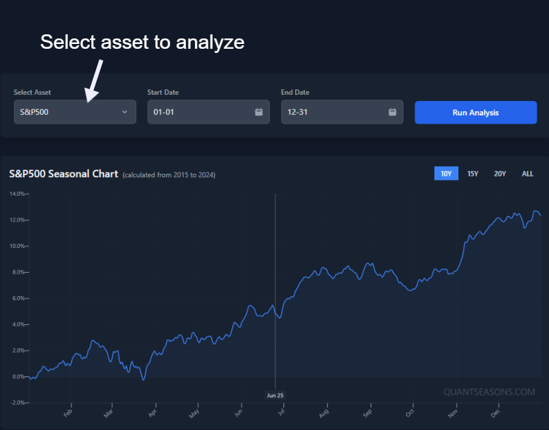
You can type to filter, or just select from the whole list.
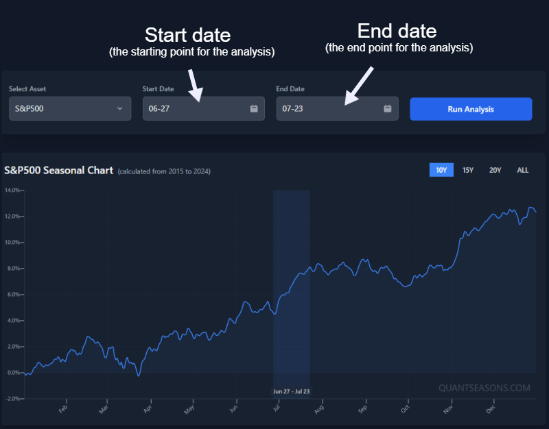
2. Date Pickers: Defining Your "Seasonal Window"
These two boxes – "Start Date" and "End Date" – are the date selections for the analysis.
But the best part? You don't need to use these, and I'll show you why in a minute.
But in case you already have in mind the dates you want to search, then you can define a seasonal window for the analysis here (e.g., "from March 15th to April 30th").
The app will then look at how your chosen asset performed during *this exact MM-DD to MM-DD window* across multiple historical years.
Cool, but this can be tedius, and it doesn't help you find seasonal trends unless quickly.
So let me show you where this gets REALLY interesting.
3. The Seasonal Chart: The Control Key
This is the centerpiece!
It visualizes the average fluctuations of the asset, calculated over the number of historical years you select.
Here's the secret sauce...
Click and drag horizontally on this chart! (if on mobile, tap hold and then drag).
This allows you to dynamically select a seasonal window (see video below).
When you release the mouse, the Start and End Date pickers will update, and the entire analysis (table and other charts) will re-run for this new, custom-selected window.
Pro tip: Simply click (or tap) the chart to reset the analysis to its default settings.
This intuitive and interactive way to run an analysis is incredibly powerful for quickly exploring and studying seasonal periods.
4. Years Control: How Deep is Your Love (for Data)?
Located above the main seasonal chart, you'll find buttons like "10Y", "15Y", "ALL". This tells the analysis how many of the most recent prior years of data to use for calculating its average pattern.
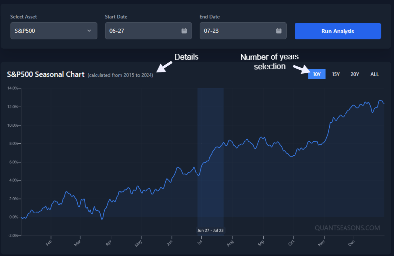
More years can give a more stable, long-term average, smoothing out anomalies.
Fewer years might reflect more recent market dynamics but can be more volatile.
"ALL" uses all available full prior years of data for the asset.
The number of years available depends on the historical data linked to that asset in the app.
5. Performance Deep Dive: Yearly Charts & The Table of Truth
Below the main seasonal chart, you get more context:
- Yearly Performance Chart: A bar chart showing the actual percentage return for your selected seasonal window in *each individual historical year*. This is vital. The main seasonal chart shows an average; this shows the variance. Was it consistently up? Wildly swinging?
- Cumulative Performance Chart: A line chart illustrating the hypothetical cumulative percentage return if you had traded this window every year. Gives a sense of long-term consistency (or lack thereof).
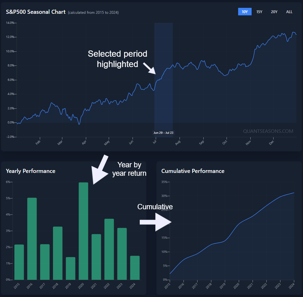
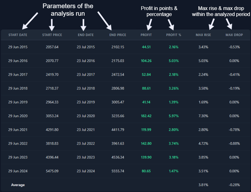
The Analysis Table is your detailed historical record. For every year analyzed, it lists:
- Start/End Dates & Prices: The actual dates and prices for that specific year's window.
- Profit in points & Profit in %: The outcome for that year's window.
- Max Rise/Drop in %: Within that window, from the start price, what was the biggest paper gain and biggest paper drawdown? Useful for understanding volatility and risk.
6. Save Your Analysis:
If you're logged in and you've run an analysis that you want to save, a "Save Current Analysis as Pattern" button is avaibale.
Clicking it saves the current asset, date window, and its historical performance stats into your "Saved Setups."
This is perfect for patterns you want to track or revisit without re-doing the analysis from scratch.
QuantStrategy: The curated seasonal patterns to follow
This section is for the traders and investors that want all the juice. Basically our proprietary algorithm every month analyzes all possible combinations of seasonal patterns to generate the top 4 trade ideas for the month.
Now you might be thinking...
Cool, but is there any edge in this?!
Performance History: How'd We Do, Coach?
The chart below displays the up to date performance of this strategy against a benchmark (the S&P 500). Both are normalized to a starting value of 100 to make comparison easier.
Performance History
(Strategy vs. S&P 500, Normalized)
Bonus: If you need more specific detail about the strategy performance get in touch at [email protected] with all your questions.
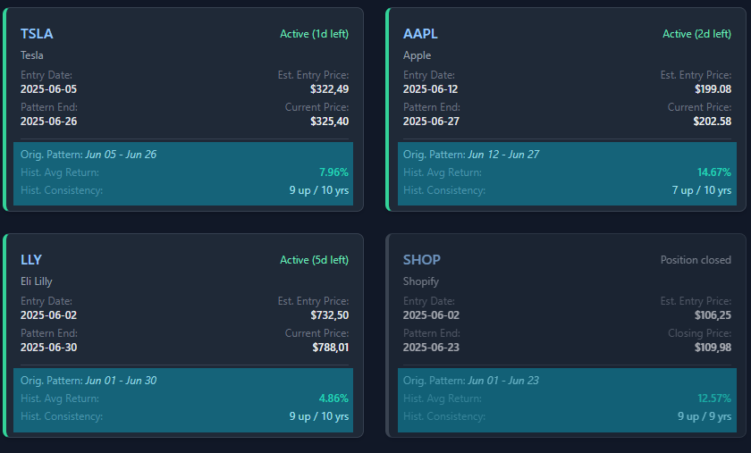
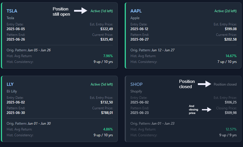
Current Recommendations:
This section lists assets the positions that are currently active or upcoming according to the strategy's logic.
It's updated at the start of every month, and it shows all the positions that are going to be opened.
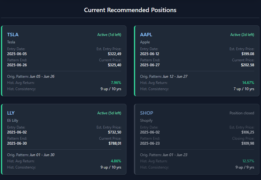
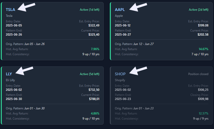
Each card shows:
- Ticker & Asset Filename: What are we looking at?
Simple.
At the start of every month, the strategy outputs 4 (or fewer) trade recommendations.
Those trades can then be followed.
YourQuant Pattern Scout: Your Automated Research Assistant
The "YourQuant" page is your friendly neighborhood pattern-finding bot. Instead of you manually dragging dates on the main analyzer, YourQuant does it all for you, finding consistent seasonal patterns that are either active now or coming up soon, and it does in just a few clicks.
Basically this is the feature that answers the question:
"Show me what has a historical edge, right now."
Simple?
Yes, let me show you...
How It Works:
It doesn't get simpler than this.
Just a few clicks, and the quant does the work...
it scans the assets, and then outputs the most consistent and strongest seasonal patters, either recently activated, or upcoming.
Choose Your Mission:
You start by telling YourQuant what to scan:
- Category Buttons: Quick scan a whole category like "Commodities" or "Currencies" from the app's available assets.
The Results: What's on the Radar?
After its scan, YourQuant presents a list of pattern "cards." Each card represents a historically consistent pattern for a specific asset that's either currently active or upcoming. You'll see:
- Asset Name & Category.
- Status Tag: "Active (X days left)" or "Starts in Y days".
- Pattern Details: The MM-DD window, historical average return, consistency score (e.g., 8 out of 10 years up), and breakdown of up/down years.
Clicking a card expands it to show a mini bar chart of that pattern's year-by-year historical performance. You also get a link to open that exact pattern in the main "Grand Analyzer" for a deeper dive.
Consistency Factor: By default, YourQuant looks for patterns that have been consistent around 80% of the time (e.g., up in at least 8 out of the last 10 years). If no patterns are found, it might suggest rerunning the scan with a slightly lower consistency threshold (e.g., 70%).
There you go!
This way you always have seasonal patterns on demand.
Ok! But what about you want more precision? Like highly curated trade recommendations to follow every month?
Oh, that's what the QuantStrategy does.
Let me show you...
And Now? Go Play, But Play Smart
You're now armed with the knowledge to navigate this app like a seasoned pro.
...or at least someone who read the manual.
Now?
The real learning comes from doing. So go ahead:
- Explore different assets on the Grand Analyzer.
- See what the YourQuant uncovers.
- Save interesting patterns.
- See what the QuantStrategy page suggests.
And for any questions:
Now, enough reading.
Go click some buttons 😉